


It's great to be a data-driving business.
It's commendable if you implement IoT technology in your enterprise.
It's challenging to turn raw terabytes of information into meaningful insights.
Tracking and monitoring any aspect of business and every part of our daily lives have become easier than ever. Being on an island beach, top managers can observe the manufacturing process of Volkswagen Tiguan production in Germany in real-time! By utilizing modern technologies, humanity can estimate the real state of nature like water and air pollution around the globe and take actions to improve the situation. That all has become possible thanks to the data and the Internet global network.
However, companies bumped into a challenge:
The volume of data all the technologies produce is enormous and can't be analyzed by people manually.
According to Amazon Web Services, data grows 10x every 5 years driven by network-connected smart devices. So the Internet of Things (IoT) makes enormous contributions to data growth, without taking into account the standard growth of information on the Internet. For example, international companies like Google, Facebook, Microsoft, and Amazon store at least 1,200 petabytes of information (which is equal to 1 200 000 terabytes).
So we have to face a question: "What should we do with all that information? Just store it and pay for the storage capacity?"
The answer is simple: "We should analyze it!"
And one of the greatest tools for that is data visualization. In the article, we find out what this term means, examine the reason why it became very popular in the 21st century, how to implement it in an IoT system through an IoT dashboard, and consider great examples of IoT data visualization implementation.
Enjoy reading!
What Is Data Visualization
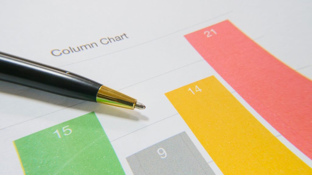
To visualize the data means to make charts out of numbers. The goal of data visualization is to provide a graphical representation of the data so analysts can identify patterns and trends. Data visualization shows great efficiency when it comes to large series of data. Its methods include graphs, bar charts, pie charts, status tables, maps, line graphs, scatter plots, and much more. These charts contain a lot of condensed information that allows analysts to see the data trends easily and make the right conclusions. Such conclusions can be priceless and bring new opportunities to businesses.
However, data visualization is a tool that is expected to be applied correctly. There are several questions you should ask yourself before building and implementing anything:
- What issue do you want to solve?
- What goal do you want to achieve?
- How do you see satisfying results after you use data visualization?
- What charts do you consider the most valuable in achieving your goal?
- Do you need real-time data updates?
These common questions are not invented by our company, but we actively use them when working with clients. And we have to admit that the number of companies that look for IoT data visualization instruments for their businesses has grown. The reason is the increased flow of the data.
Welcome To Data-Driven Area
To examine the term "data-driven area" from all sides we divide this chapter into three parts:
- Before the Internet spread
- After the Internet spread but before the Internet of Things appears
- After the Internet of Things appeared
Before the Internet appears
Data visualization has been around for a long time. For example, you can analyze companies' expenses for the previous month using a pie chart to understand the share of every expense category.
The world-famous stock exchange in the USA, New York Stock Exchange, was formed in 19 century. However, it was neither the first trading organization in the US nor the first company that issued stocks in the world. So such financial indicators like exchange rate, total sales, and stock price have a long history. Some of the tools to analyze these indicators are line charts, and histograms. This stage features human-to-human communication only.
After the Internet spread but before the Internet of Things appears
In the 1980s, the spread of personal computers (PCs) for private use began, which gave rise to a massive demand for the Internet. The Internet, in turn, initiated the emergence of international giants like Google, Facebook, Amazon, and Microsoft that store enormous volumes of data about their users. Every click you make while surfing a website, every button you push, and every item to buy you look through is stored as bits of information in their databases to study customer behaviors and needs. Modern online marketing is based on personal information about users, and data visualization is something every market specialist works with. During this stage, people started to use the term "people-to-machine communication".
After the Internet of Things appeared
Here the real data-driven area begins. The IoT network brought machine-to-machine communication that generates an incredible amount of data that cannot be processed or even stored using traditional methods. To process such massive data sets IoT uses Big Data methods, NoSQL solutions, cloud computing, and fog analytics (you can learn more about IoT architecture and fog computing in the whitepaper). IoT data visualization comes in handy here because there are no other options for people to analyze the data from IoT devices.
The IoT data is both valuable and worthless because of its volume. The trick here is to turn these massive data streams from a liability into a strength.
One of the greatest challenges for the IoT industry is the interpretation of its massive flows of data. One of the most effective ways is to use IoT data visualization and build an IoT dashboard.
IoT Dashboard As a Tool For IoT Data Visualization
Source: ctfassets
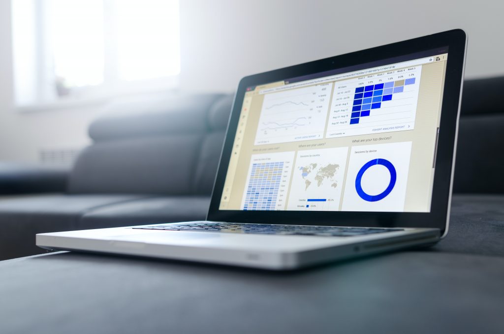
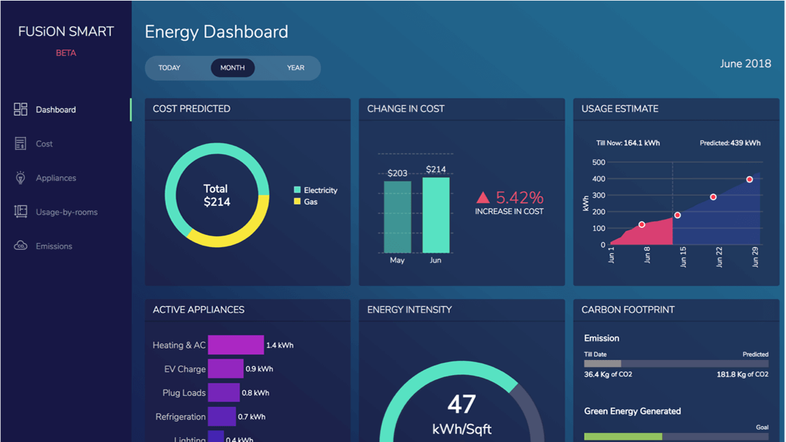
The Internet of Things dashboard (shortly, IoT dashboard) is a web page or web application that contains a visual display of IoT data on one screen. It provides at-a-glance views of key metrics that are essential to the whole system. In other words, an IoT dashboard displays meaningful visuals in a human-readable format that can be easily interpreted by a dashboard user.
Developers like to use IoT dashboards for two reasons:
- Visuals have a responsive design which means you can view a dashboard from smartphones, laptops, or tablets.
- The visual data is constantly updated in real-time. Where "in real-time" means low latency which is extremely valuable for IoT applications.
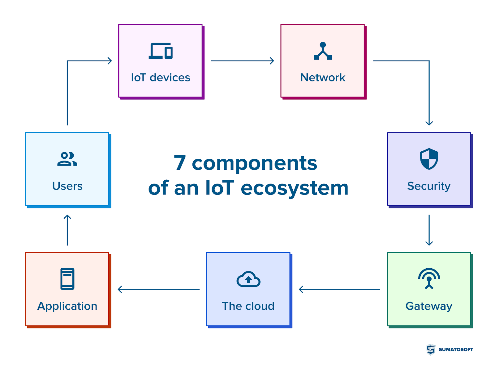
We want to highlight the fact that the IoT dashboard and IoT platform are two different entities. A dashboard is a part of the sixth component of the IoT ecosystem that is called "an application component", and it is a visual display of the metrics only. An IoT platform, in turn, covers all components of the ecosystem which means it collects the data from sensors, transfers them to the cloud or a gateway, stores, analyzes, preprocesses, encrypts, and, finally, displays.
Hence, an IoT dashboard is a part of an IoT platform in general and a part of an application component in particular.
You can see a simplified structure of an IoT ecosystem below.
Talking about a visual representation of the data, a logical question appears: what data to display? However, the answer depends on business goals and needs. It's impossible to build a universal dashboard that fits every particular case -- that is why good dashboards are mostly highly customizable.
So, let's talk about what a good dashboard looks like.
IoT Data Visualization: Best Practices
#1 Customize Dashboard to Your Need
A dashboard is a set of widgets that display some information that you consider to be meaningful for your business. So make sure that the widgets solve business challenges instead of just displaying condensed information from IoT sensors.
#2 Enable Adjustment
We have mentioned that visual data on a dashboard should be updated in real-time. An additional step here is to enable the adjusting of some parameters in real-time from a dashboard. Yes, the control option is not a function of a dashboard, but you probably will have some IoT management system behind the visual display. Interactive visualization is a very helpful tool for an analyst who can not only observe, but make some quick decisions and implement them.
#3 Don't Ignore Filtering and Sorting Options
Dealing with data involves data formatting like resizing, filtering, sorting, and data exporting. These functions are necessary.
#4 Emphasize the Data

All visuals on a dashboard should be meaningful, otherwise, you should reorder widgets, put some of them away or add them. However, sometimes some data is expected to attract attention immediately because of its importance. In such crucial situations, it's good to have rules with strictly defined conditions when a dashboard should highlight data with colors, alert, notification, or in other ways.
#5 Experiment With WIdgets
Most dashboards contain numerous tools and widgets for various cases! Don't be afraid to experiment with them and discover what sets bring better results. There are dozens of widgets at your disposal: scatterplots, interactive maps, bar charts, pie charts, line graphs, tables, timelines, and much more.
#6 Build Dashboard From The Question Perspective
What decisions and conclusions are expected to be made after analyzing the dashboards results? A good dashboard should give clues to answer this or other similar questions. The visualization should be created in such a way it will give you a response to your questions or help to find an answer.
#7 Keep Visuals Simple
Good visualization is that which allows you to quickly grasp a high-level overview of data without the necessity to dive deep into analytics. Separate semantic blocks by white spacing. Do not use a large number of different colors, try to keep the dashboard in the same color scheme. Define the notification rules strictly so that the important alert will not be lost under a bunch of other less important messages.
#8 Make Visual Labels Digestible
A dashboard is a set of widgets, charts, and maps -- analytics don't have to memorize their arrangement and its content. So make sure that all captions provide additional information on what a graph displays in a digestible way.
Why To Use IoT Data Visualization
The main reason why you should use IoT data visualization is that there are literally no other options for a human being to analyze such an enormous volume of data that comes from an IoT system. Besides that, IoT data visualization is an important part of the whole IoT system with its benefits like predictive maintenance, reducing operational costs, higher productivity, and much more. Instead of describing its benefits, we provide 5 examples of how this technology is used in different industries.
Examples of Data Visualization In IoT
World's Air Pollution. Real-time Air Quality Index
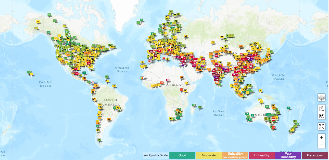
Source: waqi.ifo
Let's go back to the pollution topic. Nowadays, more and more people turn their heads toward this issue and start green initiatives aimed at raising awareness of this issue and improving the situation by implementing green technologies. One of such initiatives is a world's air pollution dashboard that has been monitoring air quality all over the globe since 2014 with thousands of installed quality monitoring stations and IoT data visualization. You can look at an interactive map and see areas where the air is good, unhealthy, or even hazardous.
Agriculture Living Laboratory: WHIN innovation network
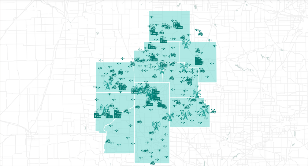
Source: whin.org
Wabash Heartland Innovation Network deployed hundreds of weather stations across the Indiana region in the USA to share information about the weather conditions and farmers' assets. By using IoT data visualization, the company aims to make the densest agricultural weather network in the country. It has already covered a 10-country region, providing an expansive network of internet-connected sensors that aggregates and disseminates the data it obtains to all participants. By sharing information, farmers become more efficient, save time, and increase yields.
Arla Foods: Transparent Delivery From a Farm to a Fridge

Arla Food is a multinational cooperative based in Denmark and the largest producer of dairy products in Scandinavia. Arla is committed to high standards of animal welfare, product quality, and safety. The company also looks for opportunities to use modern technologies to make its products and services even better. One of the areas is tracking and improving the journey that milk products take from сows to customers with the help of IoT data visualization. The company used the Power BI visualization tool along with other technologies like SQL and Azure to bring an idea of transparent delivery to life.
Grundfos: Quick and Informed Manufacturer
Grundfos is a Danish company with more than 19,000 employees globally and it is the largest pump manufacturer in the world. During the company's growth, the Business Intelligence department became a bottleneck since all reports and dashboards for all data from the factory, Internet of Things devices, and ERP system go through this department. As a result, report development speed diminished.
The company referred to a cloud-based reporting and IoT data visualization tool to correct the situation. This decision sped up the reporting process as well as provided additional opportunities for visualization both for small analytic groups of users and on a bigger scale in the form of a dashboard that displays on a large screen on a production floor.
Dashboards and Data Visualization in a Highly Technology Company

Siemens is a technology company focused on industry, infrastructure, transport, and healthcare. The company provides the next generation of data-powered customer service for the rolling stock industry in the U.K. and beyond. IoT Data visualization can bring great benefits to such a technology company as well. Siemens strives to empower its customers with resource-effective factories, resilient supply chains, smart electricity grids, clean transportation, and much more. By using the Grafana tool the company managed to observe the data from the trains in real-time and optimize their maintenance sequencing. Another case is building a temperature monitoring and control dashboard that helps to increase the lifespan of trains and decrease their downtimes.
IoT Data Visualization Dashboard from SumatoSoft

SumatoSoft helps companies to digitalize their businesses and develops meaningful visualization for clients' businesses. For example, we build a platform for monitoring the work of industrial (commercial) refrigerators online with instant alerts on urgent issues and management of historical data. You can look at the whole case study in the link.
We are recognized as top software developers by leading analyst agencies like techreviewer, clutch, and goodfirms. We also became a member of The Council for Inclusive Capitalism to make the world a better place.
We believe that a vast background of knowledge, professionalism, and expertise will be helpful to your business too.
Get in touch with us for a free consultation. Let's build a new product together.
Afterward
As for keeping up with the advent of technology, the world looks for new opportunities to analyze the data that is generated in enormous volumes by computers and new technologies. We entered the data-driven area, and with the arrival of the Internet of Things systems and machine-to-machine communication traditional methods became unfit even for data storing and processing. The IoT industry faced a new challenge: processing and analyzing massive flows of data.
New technical solutions like NoSQL databases solved the issue of data processing, while IoT data visualization is expected to address the issue of data analysis. Analysts started to use the Internet of Things dashboards to aggregate the most valuable information in one place. Dashboards became especially popular in the IoT industry thanks to their responsive design and real-time data updates.
The IoT visualization was implemented to build various solutions for agriculture, supply chain, manufacturing, technology sector, and to develop a solution for tracking world air quality. That's all sounds impressive, and we expect the implementation of IoT technology along with data visualization will rise.
Thanks for reading!